
Creative is often overlooked when it comes to advertising. The ‘ad age’ has disappeared and the art of messaging and capturing creative has been lost forever. Incorrect! Creative is critical to the role in advertising, and it is going to be even more important as time goes on.
If you have read our blogs before, the ‘Cookieless future’ has had quite a few mentions and that is because it is probably the biggest change to marketing since the internet (big statement). The removal of cookies is going to put more emphasis on creative than ever before and this is due to not being able to measure the impact of advertising. We are moving into an age where you get one shot to capture a user’s attention and you have to make the most of it.
Also, let’s not forget that on average, we each see approximately 6,000 digital ads a day; we are fighting for attention. If your creative is poor, you have wasted an opportunity!
B2B is not known for its creative – we are changing that
At some point in time, B2B companies and B2B agencies decided that they weren’t going to be creative anymore and they would leave it to the B2C companies. A constant message that we say to clients (and anyone that will listen) is that you are still marketing to people, and your decision-makers are constantly changing. Millennials now make up nearly two-thirds of all B2B decision-makers and their expectations are very different to gen-x.
What makes strong creative?
Vary Your Visual Content
Just as you vary the copy and content in each of your social media posts, it’s important to try out different design approaches and graphic elements to create more interest.
Balance
Whether it’s through white space, objects, various colour/ textures, or the treatment you use for a photo, there are many different ways to create balance. When you consider the balance of a visual, feel free to play a bit with elements that have symmetrical and asymmetrical balance. Creatively placing large and small objects, or light and dark spaces that can make your images more intriguing for viewers.
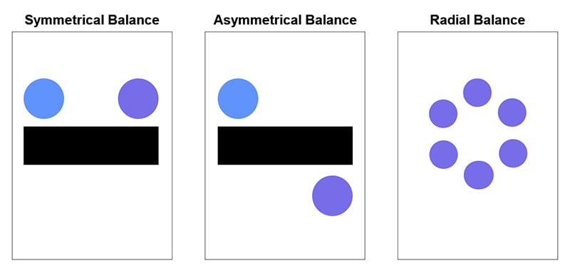
(Source: Principles of balance that are seen and used in design)
Use bold and bright colours
Bold and bright colours attract attention, and it’s in people’s nature to be drawn to them. Unless your brand is associated with elegance and luxury, in which case deep and dark tones are more suitable, an image with vibrant colours will catch the viewers’ eye more effectively.
Hierarchy
Hierarchy is another major principle within design. By assigning a different level of importance to the visual elements, you are guiding the viewers through the individual regions of the image.
Cremarc Creative Process –The four C’s!
Communication: sharing thoughts, ideas, and questions
Cremarc will often start with gathering as much information from the client to achieve their goals. Also, a major part is looking at direct competitors. This gives us a great idea of what’s out there in their industry and what has been successful.
Collaboration: working together to reach a common goal
Collaboration is the practice of working together to achieve a common goal.
Cremarc will often start with an ideation meeting internally so that we can start the problem-solving together. Practicing collaboration and teamwork helps us understand how to address a problem, pitch solutions, and decide the best course of action.
When we partake in this, we often learn that the team has varying ideas. It is important that everyone speaks up, as they may have the best idea for the job that someone else hasn’t thought of. We like people to come to the table with two ideas so we can compare and contrast the concepts and see what fits best.
Critical Thinking: looking at problems in a new way
Part of critical thinking is problem-solving, working through things like puzzles that challenge the brain, and simply asking “Why?”. But in today’s world where we can get information at the click of a button, a large part of critical thinking is being able to look at information and decide if it is credible or not.
Creativity: creating original ideas
Creativity simply just means to think outside the box and that can be in any area. This stage is to produce everything discussed and researched into something visual. The most important thing is to create impact.
Here are the B2B companies that are doing it right

Use of colour
Colour is crucial. Monday.com have cleverly chosen the ‘traffic light colour system’ as their main colours. Their product includes these colours indicating a job’s status immediately showing whether something is “Done”, “Stuck”, or you are “Working on it”. The choice of colours also allows for some impactful creatives.
(Source: Monday.com’s brand colours)
Direct
They are direct and it’s a huge part of their power. They know they have a great product, so they put it right out there. This is highlighted in their social media presence.
Clever logo
The lines in the logo make up a subtle “M”. This also allows for a slick app icon, so when switching to mobile, they’re keeping up strong brand consistency.
![]()
(Source: Monday.com’s logo design in the style of the letter M)
Clean design
Their site/social media presence is clean and friendly – whilst being professional. Their website is also intuitive. The potential customer can see where things are, streamlining the overall user experience.
(Source: Two social posts from Monday.com’s LinkedIn account)
Engaging animation
The logo, typography, and colours have been stripped back, which leaves room for the clever use of animation to inject a whole load of Monday.com personality into the design.

Use of colour
Vibrant fun colours used on their website make this design very eye-catching.
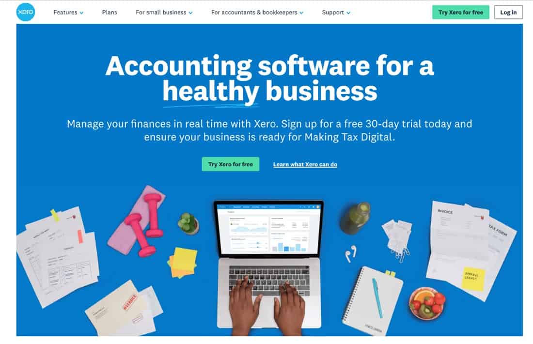
(Source: Xero’s website design)
Combination of colour/imagery
They use a lot of flat colour design with imagery which makes everything stand out.

(Source: Flat colour designs seen on Xero’s website)
Consistency
No matter what Xero are promoting or supplying, the use of a blue consistent colour all the way through their brand makes everything clear and ‘on brand’.
In essence, creative is vital when advertising. Without it, your marketing efforts lack the impact they need to grab consumer attention. At Cremarc, this is our focus. We don’t simply advertise – we make a memorable impact in the market.
Do you want to improve your brand positioning with eye-catching, scroll-stopping creative? Get in touch: https://www.cremarc.com/contact